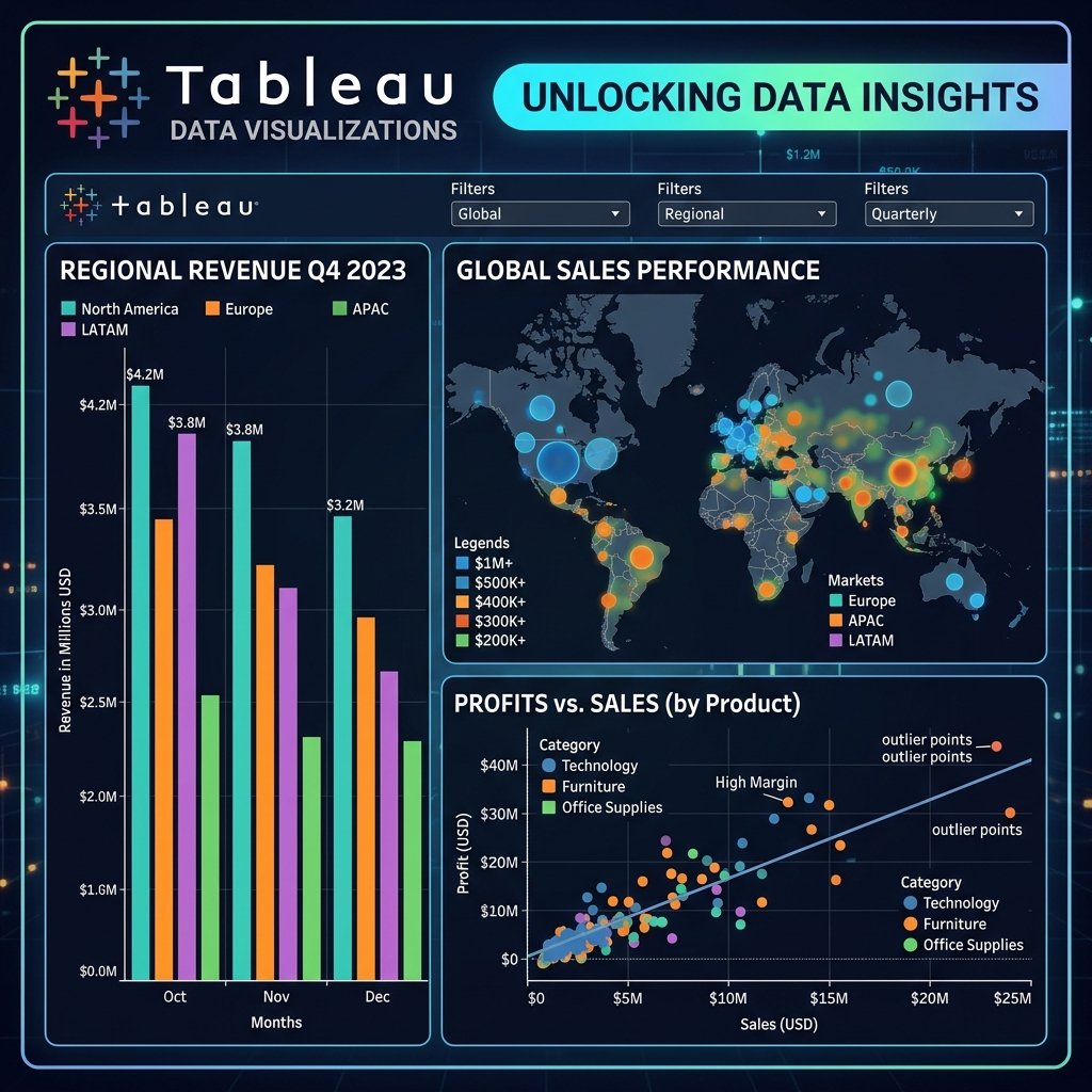
The Art of Visualizing Data
In the world of Business Intelligence (BI), Tableau is often regarded as the gold standard for visual analytics. While other tools focus heavily on data modeling, Tableau shines in its ability to create stunning, highly interactive, and complex visualizations with a simple drag-and-drop interface.
Why Choose Tableau?
Tableau is incredibly popular in enterprise environments. It handles massive datasets effortlessly and renders graphics beautifully. It is designed to help people see and understand data quickly.
Best Practices for Tableau Dashboards
Building a dashboard is easy; building an effective dashboard is hard. Here are best practices to elevate your Tableau skills:
- The 5-Second Rule: A user should understand the main message of your dashboard within 5 seconds. If they have to hunt for the insights, your design is too cluttered.
- Strategic Use of Color: Do not use color just to make things pretty. Use color to highlight anomalies (e.g., Red for negative profit, Green for positive) or to group related categories. Keep your palette consistent.
- Top-Down Design: Place your most important high-level KPIs at the top left (since people read left to right, top to bottom). Place detailed, granular tables at the bottom.
- Avoid Pie Charts (Usually): Humans are bad at judging angles and area. A bar chart is almost always better than a pie chart for comparing values.
Advanced Tableau Features
Once you master the basics, you should dive into Tableau's advanced features:
- Level of Detail (LOD) Expressions: These allow you to compute values at the data source level and the visualization level simultaneously, giving you immense control over aggregations.
- Parameters: Make your dashboards dynamic by allowing users to input values that change the underlying data or calculations.
- Story Points: Tableau allows you to create a presentation-style sequence of visualizations to guide an audience through a specific data narrative.
Tableau is a skill that blends analytical rigor with creative design. Mastering it makes you an invaluable asset to any data team.